CSS 过渡、变形和动画
一、过渡(Transition)
CSS Transitions是CSS的一个模块,它允许你创建在指定的CSS属性值之间逐步的转变,例如将一个属性从某个值在指定的时间内转变到另一个值。
并不是所有的属性都可以进行过渡,而且如果在插入元素(.appendChild())或改变display属性(display:none)后立即使用过渡,元素将视为没有开始状态,如终处于结束状态;可以在改变属性前使用window.setTimeout()延迟几毫秒或修改opacity或position的值来创造渐进效果。
下图的例子中,在2s内对width、height、background-color和transform属性做了过渡,初始状态为.box,鼠标划上去后开始过渡,过渡后的状态为.box:hover:
.box{
	border: 1px solid gray;
	width: 100px;
	height: 100px;
	background-color: gray;
	transition: width 2s, height 2s, background-color 2s, transform 2s;
}
.box:hover{
	width: 200px;
	height: 200px;
	background-color: #89EEFE;
	transform: rotate(360deg);
}
1、transition-property
此属性指定了要使用过渡效果的属性名称,默认值为all,表示会过渡所有可以过渡的属性。
transition-property: none;
transition-property: all;
transition-property: width, height
2、transition-duration
此属性指定了过渡效果持续的时间;值以秒(s)或毫秒(ms)为单位,默认值为0s,表示不出现过渡动画,属性会瞬间完成转变;不接受负值。
可以指定多个时长,每个时长会被应用到transition-property中对应的属性上;如果时长个数小于属性个数,那么时长列表会重复;相反,则时长列表会被裁减。
transition-duration: 5ms;
transition-duration: 1s, 500ms;
3、transition-delay
此属性规定了在过渡效果开始作用之前需要等待的时间;值以秒(s)或毫秒(ms)为单位,如果为负值,表示过渡效果立即开始,但会提前结束。
transition-delay: 1s;
transition-delay: 2s, 300ms;
4、transition-timing-function
此属性设置过渡期间的速度变化,默认值为ease。
此属性可以设置多个值,每个值会被应用到transition-property中对应的属性上;如果function的个数小于属性个数,缺少的值会被设置为默认值(ease);相反,同样会被截断至合适的大小。
transition-timing-function: ease ease-in ease-out ease-in-out linear;
transition-timing-function: step-start step-end cubic-bezier(0.1, 0.7, 1.0, 0.1);
transition-timing-function: steps(4, end);
5、trnasition
transition是对以上四个属性的简写。
- 值为一个普通值
表示需要过渡效果的属性,其值为:none、all或CSS属性名。
- 值为一个定时函数
表示设置过渡期间的速度变化。
- 值为一个或两个时间值
第一个值被应用到transition-duration属性上,第二个值被应用到transition-delay属性上。
二、变形(Transform)
CSS transform属性可以通过修改坐标,在不影响正常文档流的情况下对HTML元素进行旋转、倾斜、缩放等变形,变形可以在二维或三维空间中。
1、transform-origin
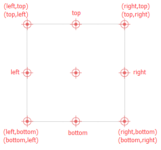
指定变形原点的位置,默认为元素的中心,可以被移动。很多变形都会用到这个属性,例如:旋转、缩放和倾斜,它们都需要一个指定的点作参量。
此属性的值可以使用一个、两个、或三个值为指定,其中每一个值都表示一个偏移量:分别表示水平(X轴)偏移量、垂直(Y轴)偏移量和Z轴偏移量。
-
一个值
值必须为一个长度单位、百分比或
left、center、right、top、bottom关键字中的一个。-
样例:
transform-origin: center;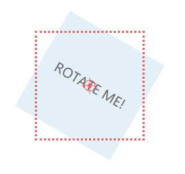
-
-
两个值
一个值必须是一个长度单位、百分比或
left、center、right关键字中的一个;另一个值必须为一个长度单位、百分比或top、center、bottom关键字中的一个。-
样例:
-
transform-origin: top left;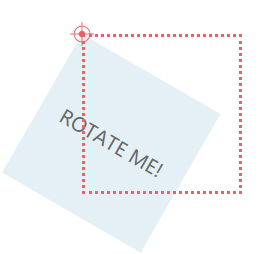
-
transform-origin: 50px 50px;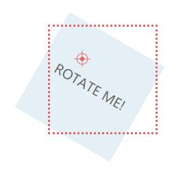
-
-
-
三个值
前两个值和只有两个值时的用法相同,第三个值必须为一个长度单位,它始终代表Z轴的偏移量。
-
样例:
-
transform-origin: bottom right 60px;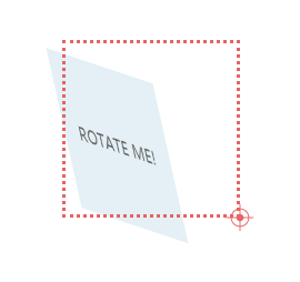
-
-
2、transform
指定作用在元素上的变形,其值为以空格分隔的一系列变形的列表。
-
旋转
rotate以原点(由
transform-origin属性指定)为中心将元素旋转一个特定角度,正值向顺时针方向旋转,负值向逆时针方向旋转。-
语法:
transform: rotate(angle);angle为角度,例如:
rotate(30deg)。 -
Example:
transform: rotate(45deg);
-
-
缩放
scale将元素放大或缩小指定的比例。
-
语法:
  /*二维缩放,如果sy未指定,默认和sx值相同*/
  transform:  scale(sx[, sy]);
  /*X轴缩放*/
  transform:  scaleX(sx);
  /*Y轴缩放*/
  transform:  scaleY(sy);
其值为一个或两个无单位的数字,例如:
scale(0.5, 2)、scaleX(1.5)、scaleY(0.3)。 -
样例:
transform: scale(1.5);
-
-
倾斜
skew将元素在X轴和/或Y轴上以指定的角度倾斜。
-
语法:
  /*在X轴和Y轴按指定的角度倾斜,如果ay未指定,则在Y轴上不倾斜*/
  transform:  skew(ax[, ay]);
  /*绕X轴的倾斜角度*/
  transform:  skewX(angle);
  /*绕Y轴的倾斜角度*/
  transform:  skewY(angle);
其值为一个或两个角度值,例如:
skew(30deg,-10deg)、skewX(-30deg)、skewY(45deg)。 -
样例:
transform: skew(30deg, 15deg);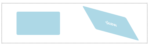
-
skew变化原理:http://blog.sina.com.cn/s/blog_610883950102wffx.html
-
平移
translate按指定的长度平移元素。
-
语法:
  /*用向量[tx,ty]完成2D平移,如果ty没有指定,则默认为0*/
  transform:  translate(tx[, ty]);
  /*在X轴平移*/
  transform:  translateX(tx);
  /*在Y轴平移*/
  transform:  translateY(ty);
其值为一个或两个长度单位或百分比,例如:
translate(-50%,-50%)、translateX(100px)、translateY(-100px)。 -
样例:
transform: translate(200px, 50px);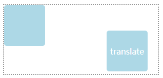
-
三、动画(Animation)
CSS动画可以将一个CSS样式转换到另一个CSS样式,动画包括两部分:描述动画的样式规则和指定动画开始、结束以及中间点样式的关键帧。
1、关键帧
可以使用@keyframes指定动画中特定时间点必须展现的关键帧样式(停留点)来控制CSS动画的中间环节;每个@keyframes规则包含多个关键帧(一段样式),每个关键帧有一个百分比值作为名称;关键帧的编写顺序没有要求,最终会按百分比由小到大的顺序触发。
- 语法
@keyframes <keyframes-name> {
  <keyframe-block-list>
}

/*keyframe-block*/

from |to | <percentage> {
	<declaration-list>
}
其中:keyframes-name为帧序列名称;<percentage>表示在动画序列中,触发关键帧的时间点,用百分比值来表示;form等同于0%,to等同于100%。例如:
@keyframes slidein {
	from {
		margin-left: 100%;
		width: 300%;
	}

	to {
		margin-left: 0%;
		width: 100%;
	}
}
-
备注
-
为了让关键帧序列生效,它必须包含了对
0%(from)和100%(to)即动画的开始帧和结束帧的定义。 -
如果在关键帧样式中使用了不能动画的属性,那么这些属性将会被忽略。
-
如果定义多个相同的关键帧(百分比)将以最后一次定义的为准
-
2、配置动画
需要使用animation属性或其子属性来配置动画时间、动画时长以及其他动画细节,此属性并不配置动画的实际表现,动画的实际表现是由@keyframes规则定义的。
-
animation-name设置动画名称,即由
@keyframe定义的关键帧名称 -
animation-delay设置动画的延迟时间(从元素加载完成到动画开始执行的时间),单位为秒(s)或毫秒(ms),默认值为0s。如果值为负值,则会让动画立即从它的动画序列中的某个位置开始,例如:如果设置为-1s,则动画会从它的序列的第1秒位置处立即开始。
/* Single animation */ animation-delay: 3s; /* Multiple animations */ animation-delay: 2.1s, 480ms; -
animation-direction设置动画在每次运行完成之后的方向(回到原位重复运行或反向运行)
/* Single animation */ animation-direction: alternate; /* Multiple animations */ animation-direction: normal, reverse;-
normal默认值,表示每次动画结束后回到起点重新开始
-
alternate动画交替反向运行;反向运行时,动画按步后退
-
reverse反向运行动画,与normal相反
-
alternate-reverse反向交替
-
样例:
  animation-name: slide;
  animation-duration: 2s;
  animation-timing-function: ease-in;
  animation-iteration-count: 2;
@keyframes slide{ from{ margin-left: 0; } to{ margin-left: 80%; background-color: pink; } }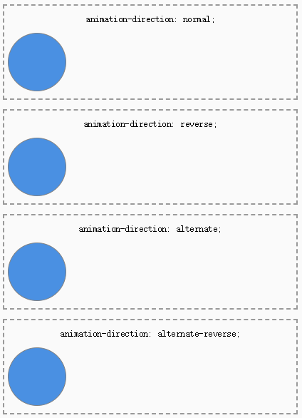
-
-
animation-duration设置动画持续的时间,默认值为0s,表示无动画
/* Single animation */ animation-duration: 120ms; /* Multiple animations */ animation-duration: 1s, 15s; -
animation-iteration-count设置动画的重复次数,值为非负数,默认值为1,可以使用
infinite让动画无限次重复,也可以使用小数,例如:0.5,表示动画从0%执行到50%。animation-iteration-count: infinite; animation-iteration-count: 2; /* Multiple values */ animation-iteration-count: 0, 3.5, infinite; -
animation-play-state允许暂停或继续动画
/* Single animation */ animation-play-state: running; /* Mutiple animation */ animation-play-state: paused, running;-
running表示当前动画正在运行
-
paused表示当前动画被暂停
-
样例:
  .ball:hover{
      animation-play-state: paused;
  }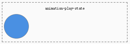
-
-
animation-timing-function设置动画速度函数,默认值
ease。/* Keyword values */ animation-timing-function: ease-in; animation-timing-function: linear; /* Function values */ animation-timing-function: cubic-bezier(0.1, 0.7, 1.0, 0.1); animation-timing-function: steps(4, end); /* Multiple animations */ animation-timing-function: ease, step-start, cubic-bezier(0.1, 0.7, 1.0, 0.1); -
指定动画执行前后如何为目标元素应用样式,默认值为
none。-
none动画执行前后不改变任何样式
-
forwards目标将保持动画执行后的样式,最后一帧的样式取决于
animation-direction和animation-iteration-count属性 -
backwards只要将动画应用于目标,动画就会应用第一个相关关键帧中定义的值,并在
animation-delay期间保持此样式;第一个相关关键帧依赖于animation-direction属性的值。 -
both同时使用
forwards和backwards规则 -
样例:
  animation-name: slide;
  animation-duration: 2s;
  animation-delay: 1s;
  animation-timing-function: ease-in;
@keyframes slide{ from{ color: white; margin-left: 0; background-color: orange; } to{ margin-left: 80%; background-color: pink; } }
-
-
animationanimation属性是以上属性的简写形式。其中,可以解析为时间的第一个值被赋给
animation-duration,第二个值被赋给animation-delay。属性定义的顺序也很重要,用于区分animation-name与其他关键字。在解析时,如果一个值是其他属性的关键字,则它不会被解析为animation-name。
/* @keyframes duration | timing-function | delay | iteration-count | direction | fill-mode | play-state | name */
  animation: 3s ease-in 1s 2 reverse both paused slidein;

/* @keyframes duration | timing-function | delay | name */
  animation: 3s linear 1s slidein;

/* @keyframes duration | name */
  animation: 3s slidein;
参考资料
-
响应式WEB设计HTML5和CSS3实战